Whether you are completely new at crypto trading or hold some experience in buying and selling these digital assets, you must have come across cryptocurrency trading charts.
As one of the easiest ways to learn about a cryptocurrency, these charts can be seen all across the web. No matter if you are visiting a crypto exchange or a digital asset news platform, these referential tools make their presence known one way or another.
If you are new at cryptocurrency trading, then you might have wondered exactly why these charts are so popular. And if you plan to make it big through the world of digital asset transactions, then the thought of understanding the intricacies of these tools may have also crossed your mind.
To help you comprehend the functionality and overall usage of these charts, here is a detailed guide on learning more about them. By going through this information, you will be able to know exactly how to make the most out of these data representation models.
What are Cryptocurrency Trading Charts?
Simply put, crypto trading charts refer to data visualizations that represent a cryptocurrency’s value and profile.
Apart from providing you with the current and historic price of a cryptocurrency, these charts also display statistics on the digital asset’s overall trading trends.
This helps casual traders and professional day traders grasp the state of different cryptocurrencies according to market trends.
By looking at real time and analytical statistics, you can make informed decisions on whether to buy or sell a specific crypto asset.
What Kind of Charts Are Available?
A typical cryptocurrency trading chart can come in various forms. These models can range from simplistic data representation to complex market projections.
Some of the most popular crypto chart types include but are not limited to:
- Bar Charts.
- Line Charts.
- Candlestick Charts.
- Point & Figure Charts.
While these are not the only types of trading charts that you can find on cryptocurrency, they remain some of the most popular forms of data visualization in crypto trading.
It is also prudent to note that all of these charts evolve from traditional asset or stock trading, which helps conventional traders understand their functionalities right off the bat.
What Can You Find on These Charts?
Through these crypto trading charts, you can find the most crucial details about the digital asset in question at a glance.
This covers aspects including but not limited to:
- Current price.
- Historic price.
- Price comparison.
- Highest value in a given time frame.
- Lowest value in a given time frame.
- Current trading trends.
- Future trading projections.
These charts are typically available on cryptocurrency exchanges, but they can also be found on crypto information or price tracking platforms. You can also see and use them through charting platforms such as TradingView.
How to Read These Charts?
Some trading charts are extremely easy to grasp, while others require a deep understanding of market and trading mechanisms. But once you learn the basics of each of these charts, you can decipher them easily.
To help you understand these charts, let’s take a look at each of their formats and what kind of details you can learn from them.
Bar Charts
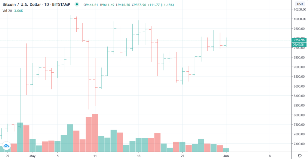
These are one of the most basic types of charts that you can see in terms of cryptocurrency data.
Bar charts usually outline the current and historical pricing trends in an easy to understand format. The typical objective of these charts is to give a status check of price movements through a simple glance.
How to Read Them?
The most basic of bar charts have a few defining factors within them.
- Open. This is the opening price for the given period, which is located at the bottom-left side of the chart.
- High. This is the highest price for the outlined period and can be seen as the tallest indication on the chart.
- Low. This is the lowest price for the given period and stands out by showing a dip towards the bottom of the chart.
- Close. This is the closing price of the specific period, which is indicated by the bottom-right section of the chart.
You can also change the extent of the data by selecting a date range.
Typically, the corresponding figures for each label are also specified at the top or bottom of the chart.
In a nutshell, you can easily read bar charts by referring to the corresponding figures and hovering over each bar with your cursor.
Line Charts
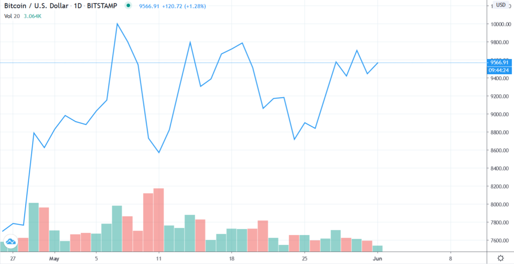
A little more detailed but still simple to comprehend, line charts are another way to take in basic information about a cryptocurrency’s pricing.
In fact, between bar charts and line charts, the latter is the more popular method for cryptocurrency price index. Due to their simplicity and ease of use, line charts are widely utilized by an array of exchanges and trading information platforms.
How to Read Them?
In their basic form, line charts indicate price movements for a given period. As such, they are not too different from bar charts in their functionality.
But instead of showcasing price index in bars, line charts follow a continuous line that indicates the value of a cryptocurrency.
They also have Open, High, Low, and Close indicators. These labels are usually shown at the top of the chart with their corresponding figures.
Similar to bar charts, you can read line charts by moving your cursor over each given value. You can also jump between different data ranges.
This makes line charts immensely easy to read and decipher even if you have never used them before.
Candlestick Charts
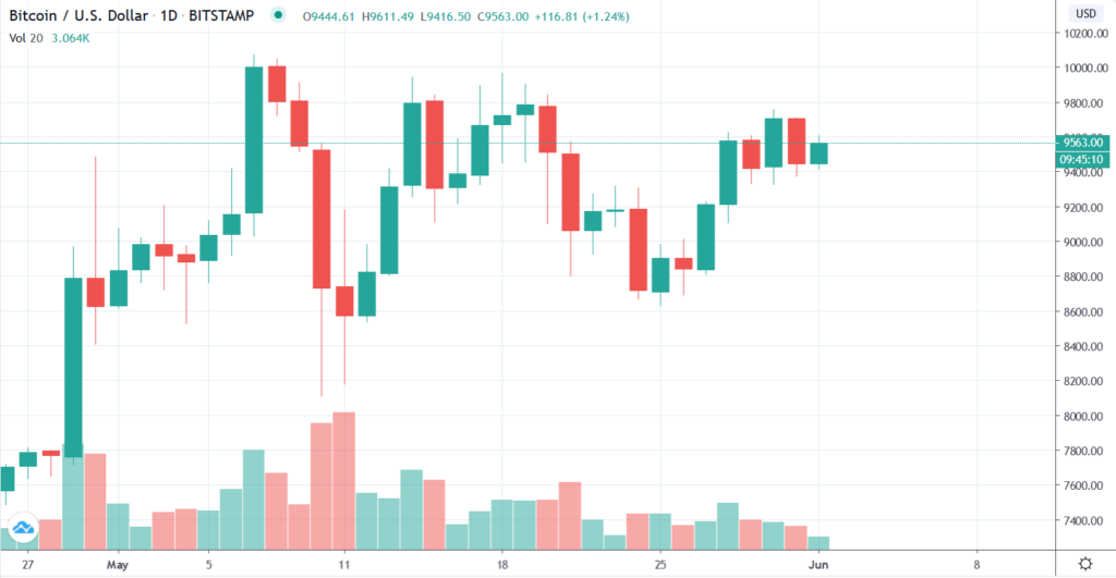
Candlestick charts are yet another popular way of tracking cryptocurrency market movement. They differ from basic bar charts and line charts by showing historical price index in a more detailed manner.
Instead of showing basic price information only once for the specified date range, candlestick charts provide you with in-depth analysis for each day. They also differentiate this data through data visualization and use different colors to indicate differences in value.
This gives you a better understanding of market movements and allows you to make your trading decisions based on historical patterns.
How to Read Them?
Due to the way they are designed, candlestick charts provide you with a multifaceted view of past prices.
At a glance, candlestick charts look quite similar to bar charts. They also provide Open, High, Low, and Close indicators. They follow the same pattern of showing opening prices at the leftmost side of the chart, and closing prices at the rightmost end.
But the similarity ends there.
Instead of seeing each of these labels only once in the selected date range, you can view these indicators within the specified period for each day. This provides you with a holistic view of past values that is not usually available with basic charts.
These Open, High, Low, and Close indicators are visualized through “wicks”.
The upper end of each candlestick indicates the High value for a day.
The lower end of each candlestick visualizes the Low value for a day.
If the candlestick is colored or filled from within, it points that the Close price was lower than the Open value.
In contrast, if the candlestick seems empty from within, it outlines that the Close value was higher than the Open price.
Candlestick charts differentiate these factors in an even easier way by sorting them through different colors. This allows you to discern these detailed figures easily.
These charts might seem a little overwhelming at first, but they are incredibly intuitive once you familiarize yourself with their overall structure.
If you want to perform your trading based upon historical patterns and market emotion, it is crucial that you understand candlestick charts. Another reason why you should learn to read these visualizations is because these patterns are also used in more detailed charts.
Point & Figure Charts
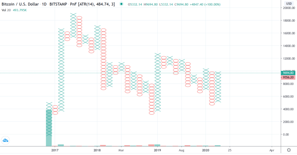
Point & figure charts provide an overall or bird’s eye view of a cryptocurrency market to help you make foundational investment decisions.
Instead of following a specified time frame, point & figure charts simply follow the price movements of an asset.
This way, these charts don’t divert your focus towards smaller price movements, but show larger price trends over the span of an asset.
This gives you a big picture view of your specific crypto rather than an intricate tour of its market.
This allows you to assess a cryptocurrency’s long term value, and lets you analyze whether or not you should make big investments or cash out when you can.
How to Read Them?
Due to their structure, point & figure charts are quite easy to understand.
But there’s a catch. Instead of using data visualization in its typical sense, these charts use X and O as defining visual cues.
In this method, Xs refer to rising prices, while Os refer to falling values.
In order to track these prices, you need to define a unit of price measurement first.
Whenever your cryptocurrency rises one unit in value, it is marked by an X.
Similarly, whenever your crypto drops one unit in price, the movement is defined by an O.
If your cryptocurrency moves up a unit and then drops right away, the movement is marked by a combined XO. It is then marked by an X when the crypto regains a unit in value.
Understanding this particular mechanism can be difficult, but the ability to set the said measurement unit by yourself justifies the complexity. Overall, this remains quite a viable way to discern large pricing movements in a cryptocurrency.
Market Profile Charts
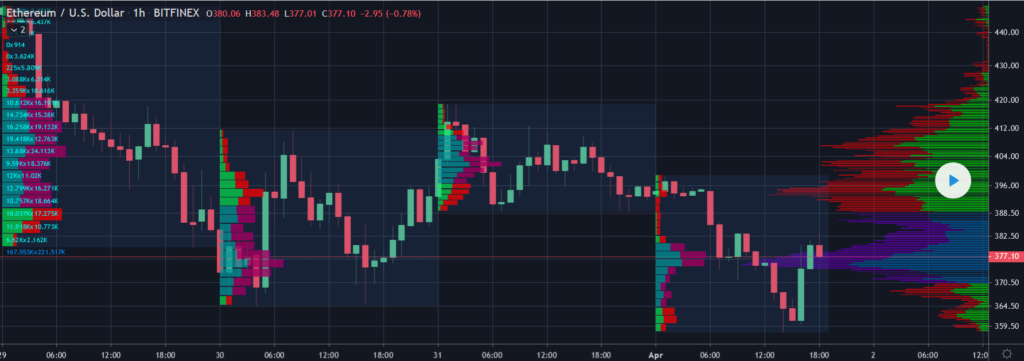
As a part of technical analysis, market profile charts deliver a holistic view of a cryptocurrency’s market.
With that being said, market profile charts are more intricate than most other charts. As such, they offer detailed visual data representation that gives you more information than just price index.
Market profile charts can be seen as a mix of bar charts and line charts, and incorporate details such as historic and current price as well as past and current trading volume.
It is also important to note that market profile charts are not widely used in cryptocurrency markets. While some standalone traders share these charts, they can come with a risk of error due to their complexity.
How to Read Them?
Market profile charts can be incredibly complex to understand. But it’s not impossible to break down the details with proper practice.
Market profile charts consist of various factors. These aspects typically include price, volume, and time frame.
- The price is sometimes indicated by candlestick charts to give you a detailed view of the price movement. But that’s not always the case. Other types of charts can also be used.
- The volume is typically outlined by horizontal charts, with longer lines indicating larger trading volume.
- The time frame spreads out through the chart and showcases information through visualization tools such as numbers or colors.
The way that this information is laid out makes market profile charts quite convoluted. You need intensive experience to interpret these charts and make decisions accurately.
However, when used correctly through a reliable charting platform or expert, market profile charts offer insights on past and present pricing as well as trading volume, which helps you project future movements of the specific market.
The Difference Between Minutes, Hours, Day Charts
With most crypto trading charts, you have the ability to set a specific time frame to the data being shown. If you are venturing into day trading, this could provide you with the opportunity to set your time frame down to minutes, hours, and even days.
The main difference between these charts is the duration and data that they cover through these settings. If you want to venture into day trading, doing a few minutes’ worth of analysis could provide you with the opportunity to benefit from small price gains. Whereas, if you want to benefit from price movements as a long term investor, then looking at a few days’ data would be more viable.
Depending upon your trading strategy and overall approach, opting for a set time frame or even going without it can provide you with your required data. In the long run, combining your analytical skills with your trading acumen can make way for you to perform ideal cryptocurrency trades.
At the end of the day, the key to reading these crypto charts lies within extensive practice. Make sure that you start reading up with the most basic of charts even when you are not making any active trades. This way, you have the proper knowledge at hand when you start buying and selling cryptocurrency.
This doesn’t only give you the ability to assess trading data, but also enhances this skill overtime. As a result, you are gradually able to use more advanced charting tools and add more capability to your skill set as a successful trader.
Excellent info! Love Crypto 🙂
Wow! 400 increase in Dogecoin this week! I guess Mark Cuban had a lot to say about it on the CNBC. Is it possible for Dogecoin to increase in price as much as Bitcoin has? I sure wish I would have bought some a while ago.